
frolik & co - toothi
packaging design
overview
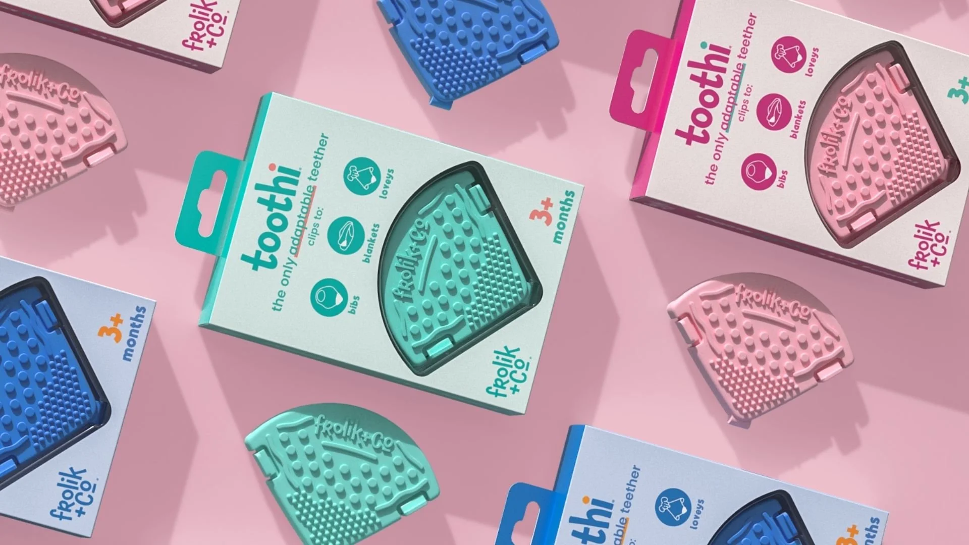
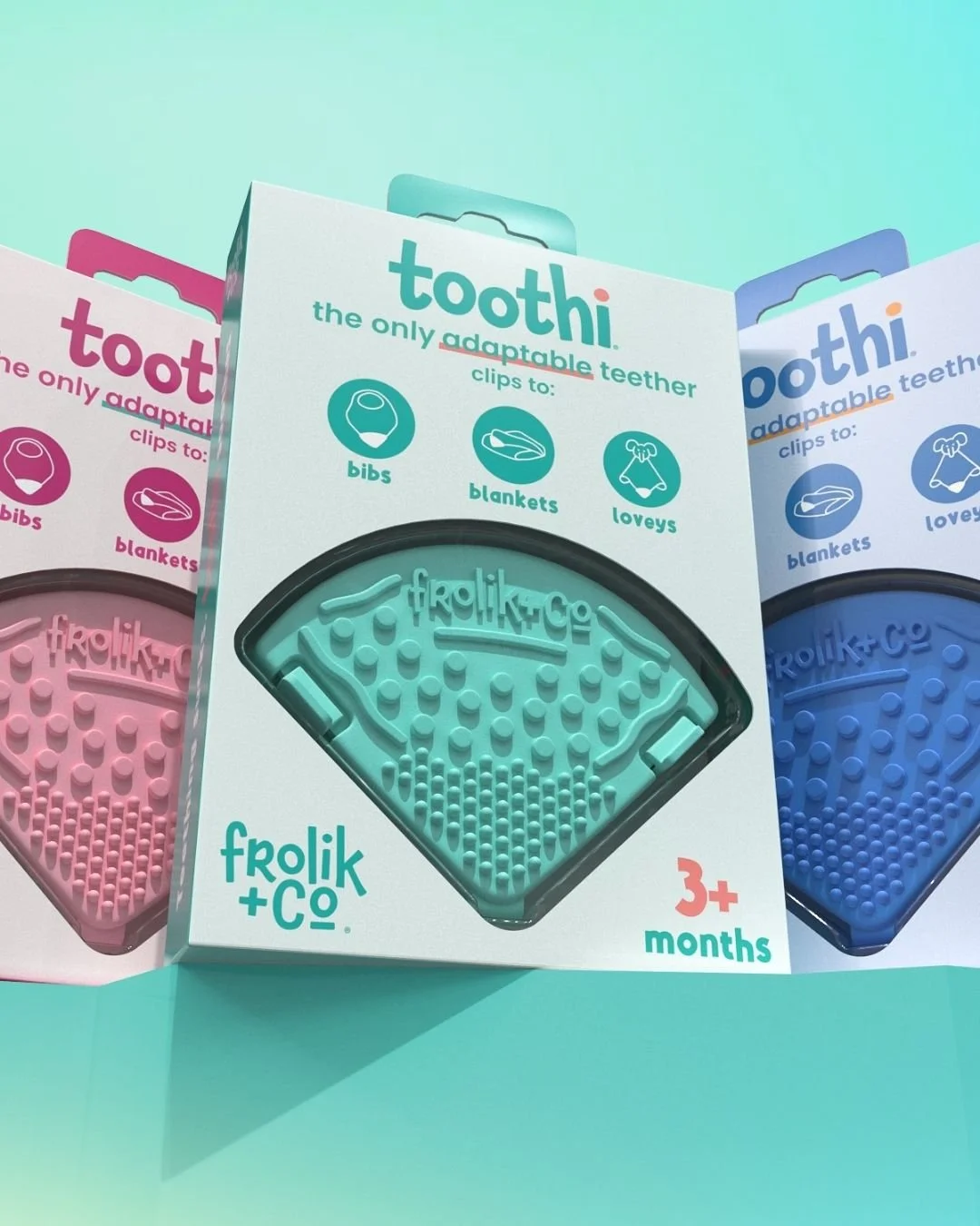
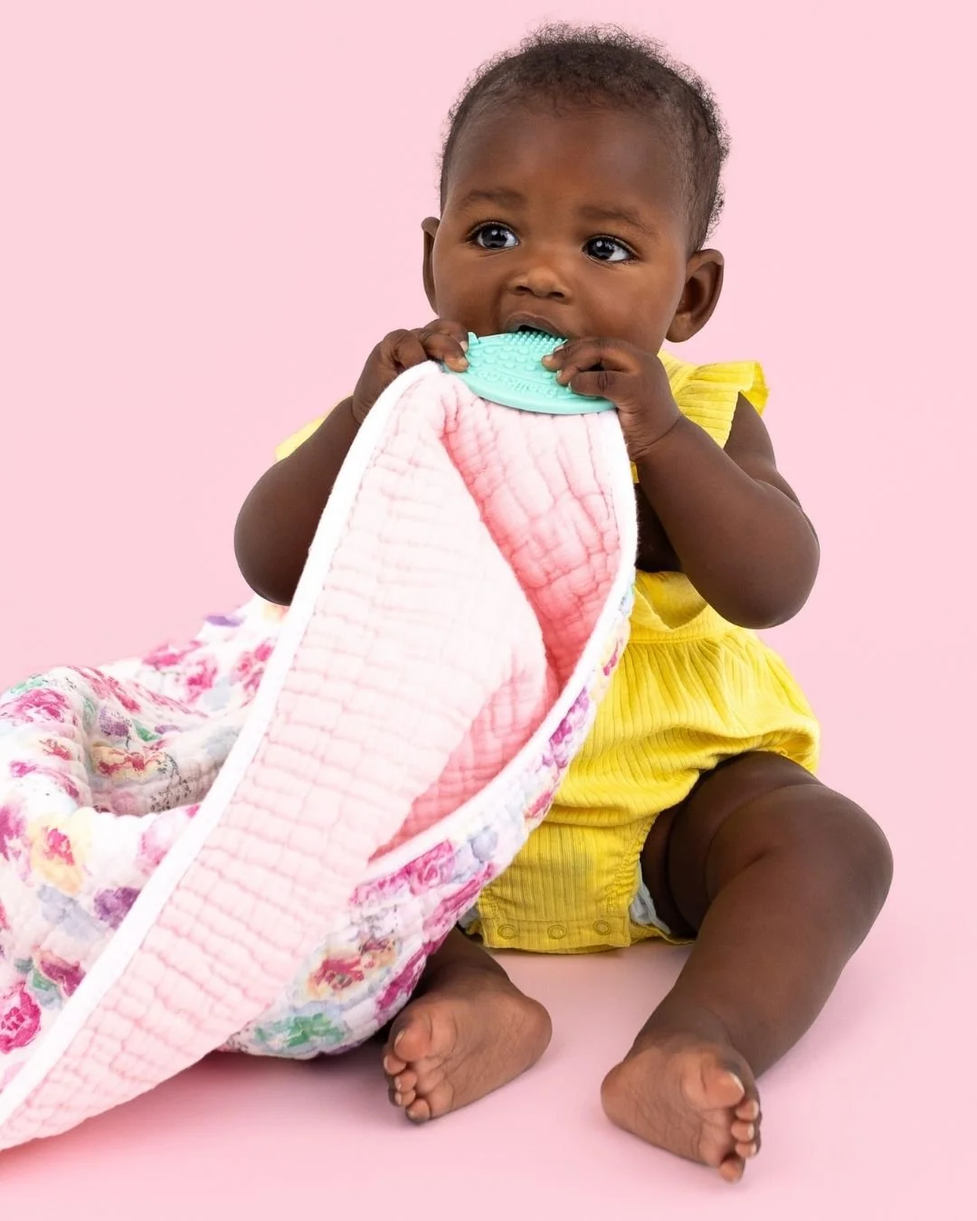
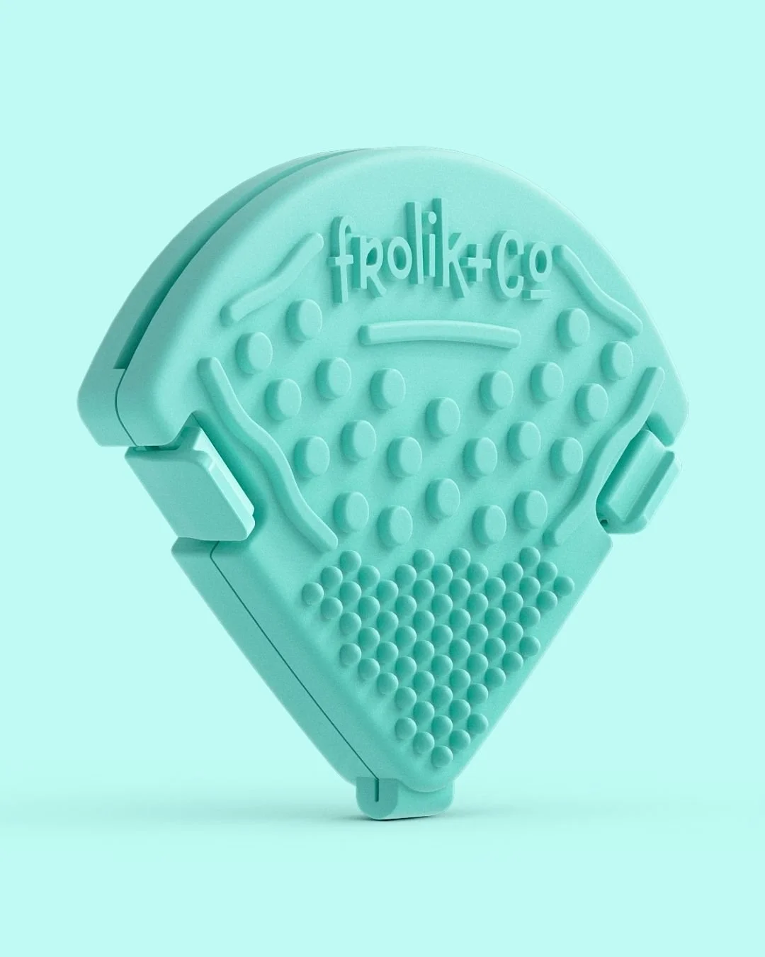
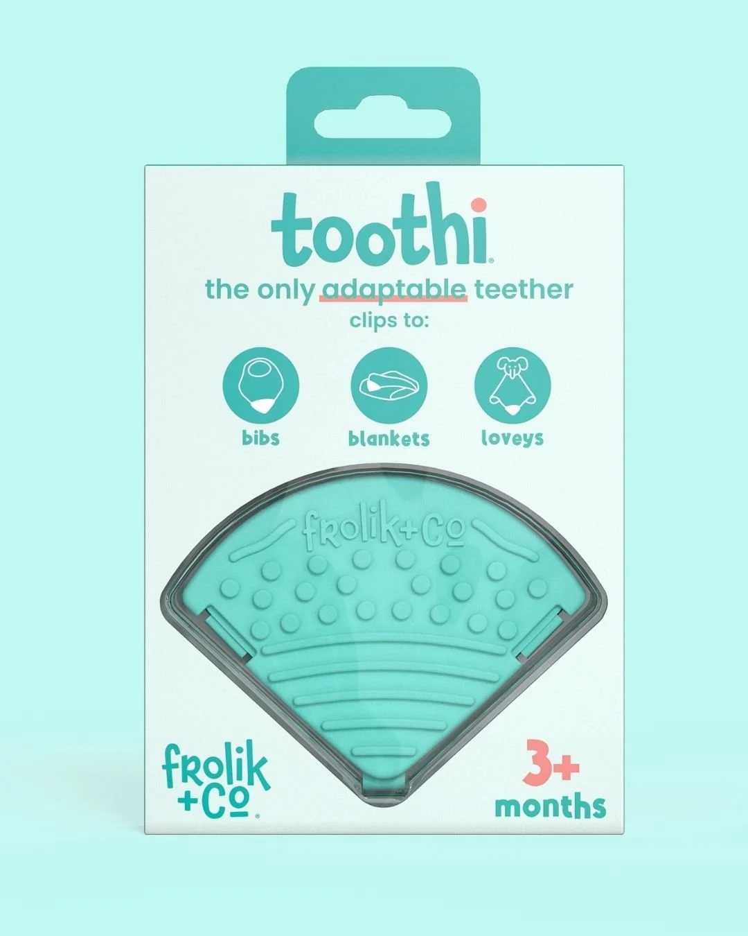
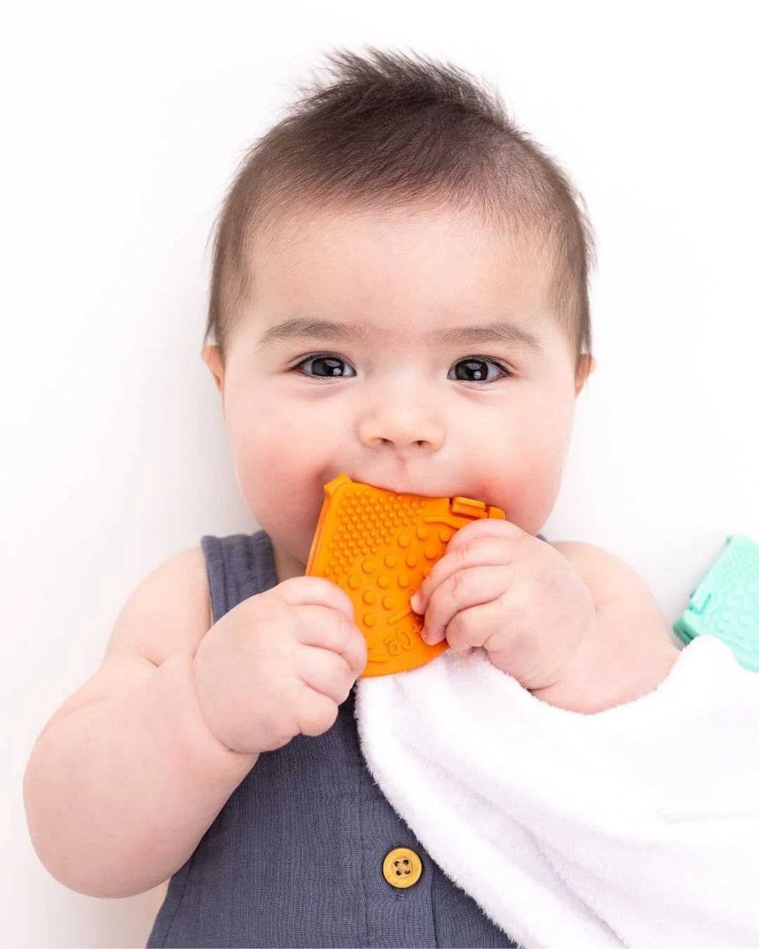
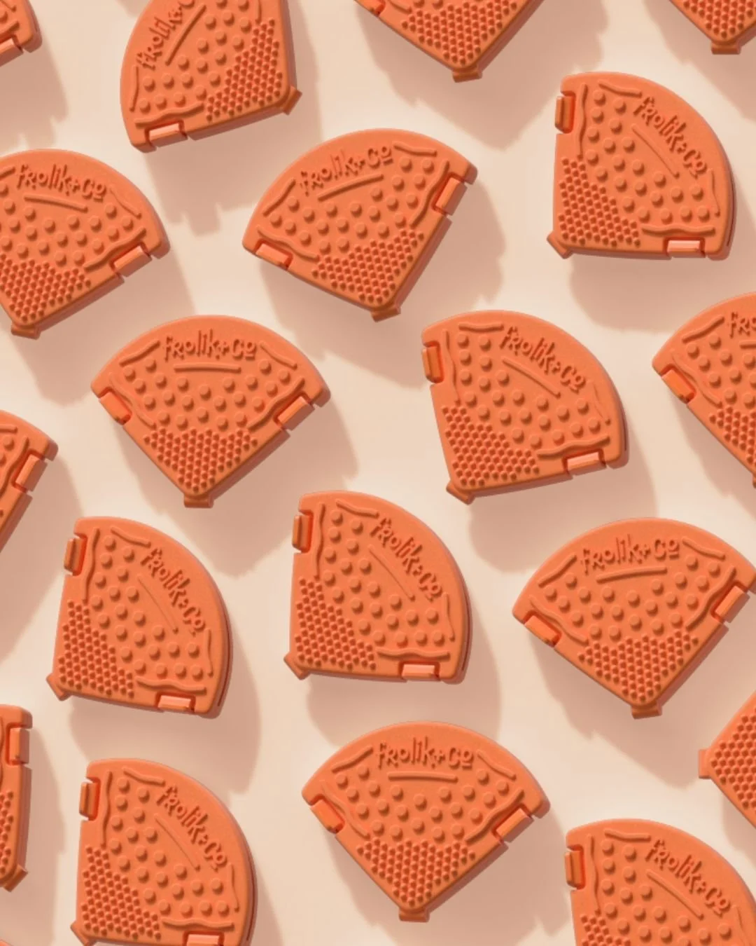
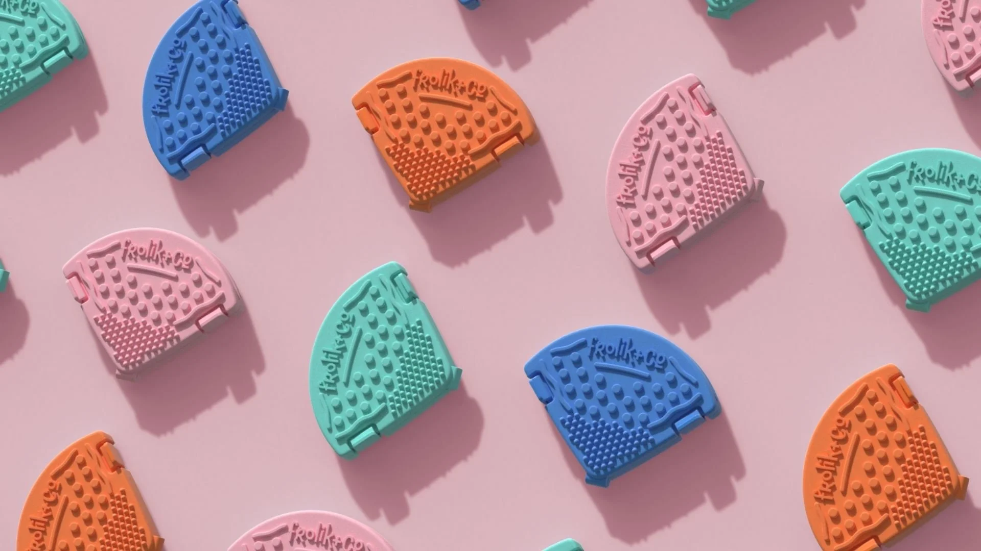
Frolik & Co. introduced Toothi, an attachable baby teether designed for modern parents, particularly mums, who value both functionality and style. the brand wanted a packaging design that avoided the typical baby aesthetic, opting instead for a vibrant, modern look inspired by skincare branding.
the challenge
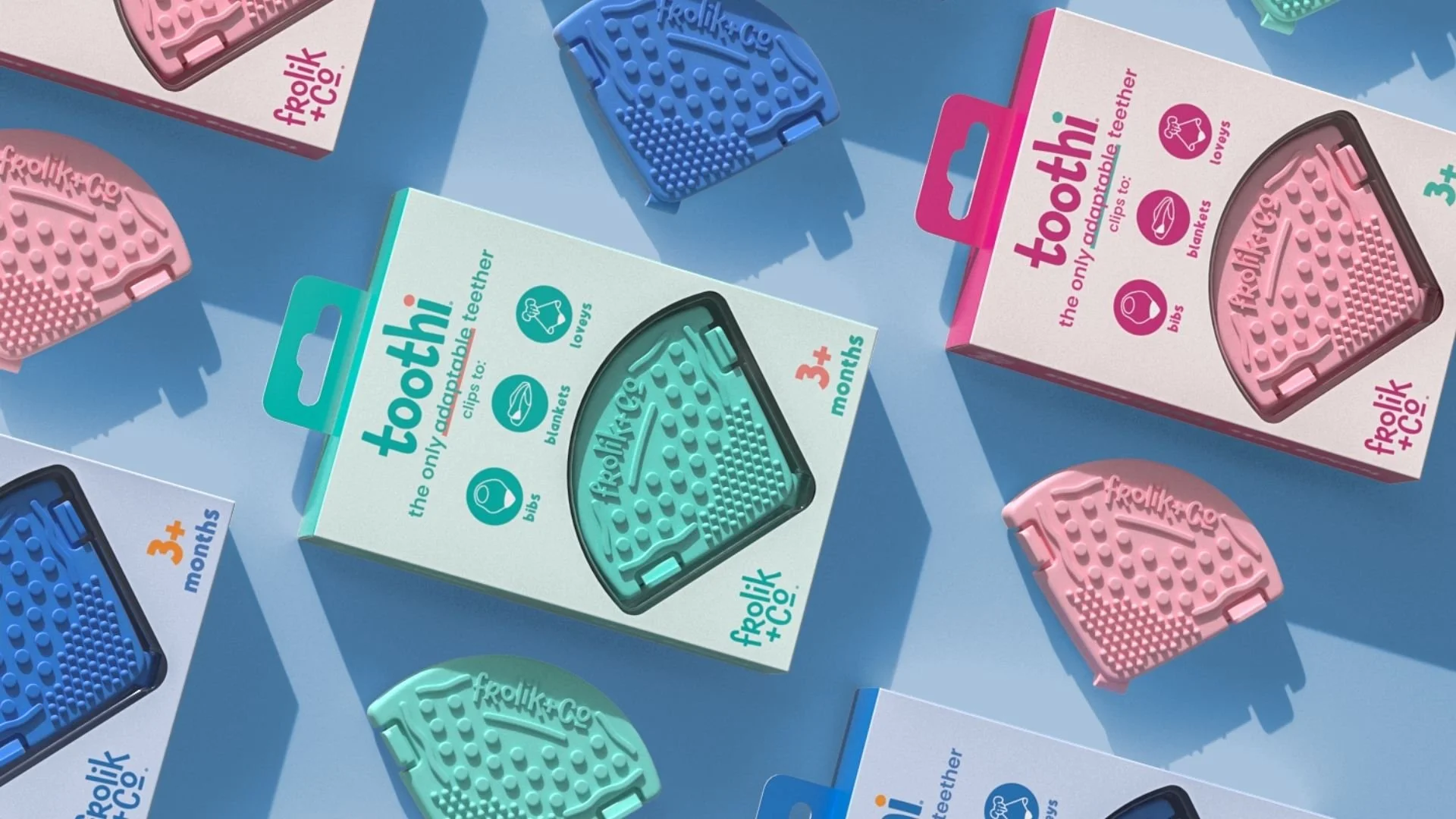
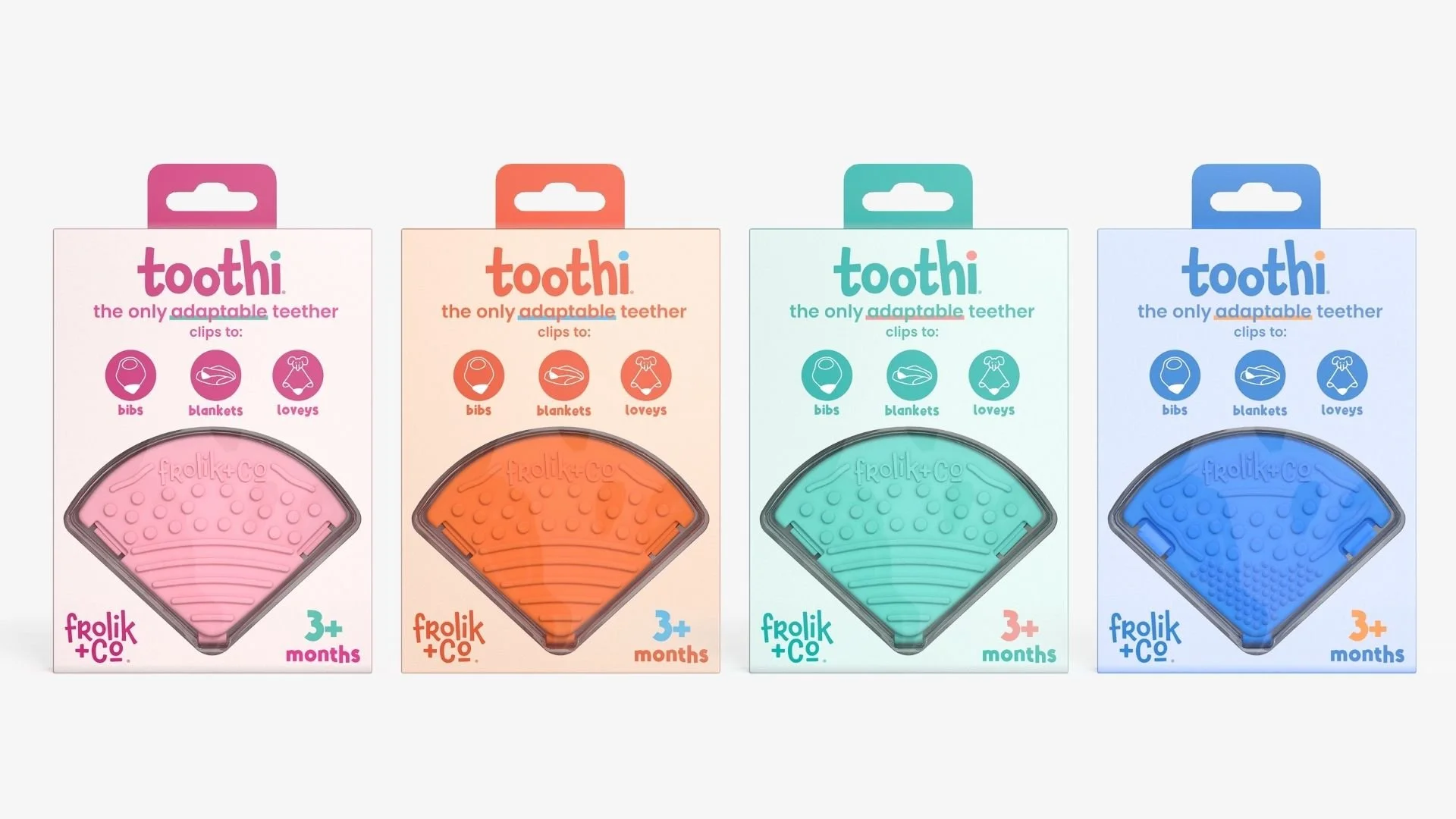
bright & fun colours: the client wanted a bold colour palette that would stand out on shelves, while also feeling cohesive and stylish.
appealing to parents: the packaging needed to connect with parents (especially mums) by looking clean, aesthetic and playful, rather than overly child-like.
balancing aesthetics and playfulness: the design had to strike a balance between being mature and approachable.
the solution
to achieve these goals, the design included:
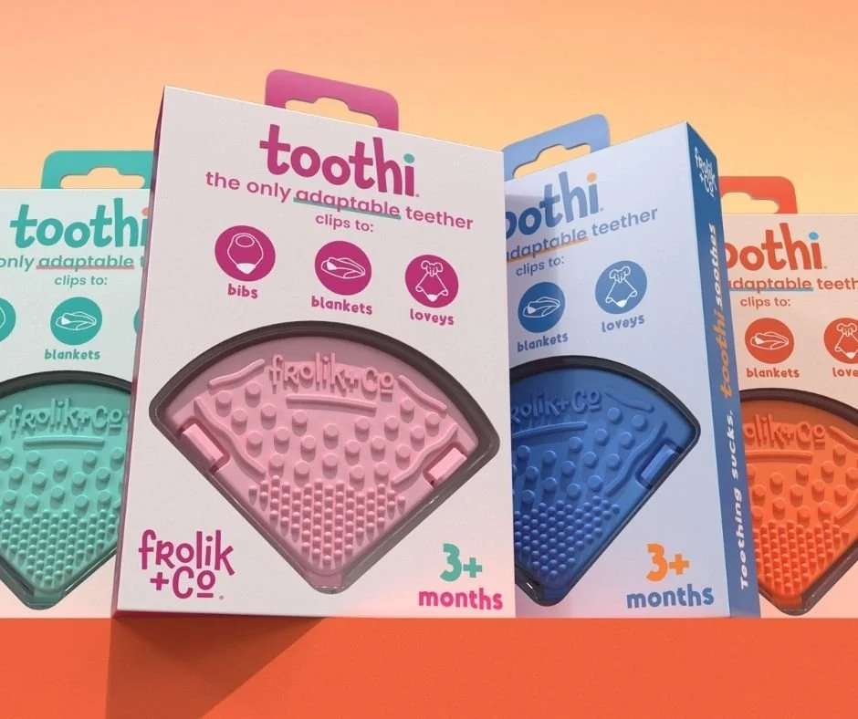
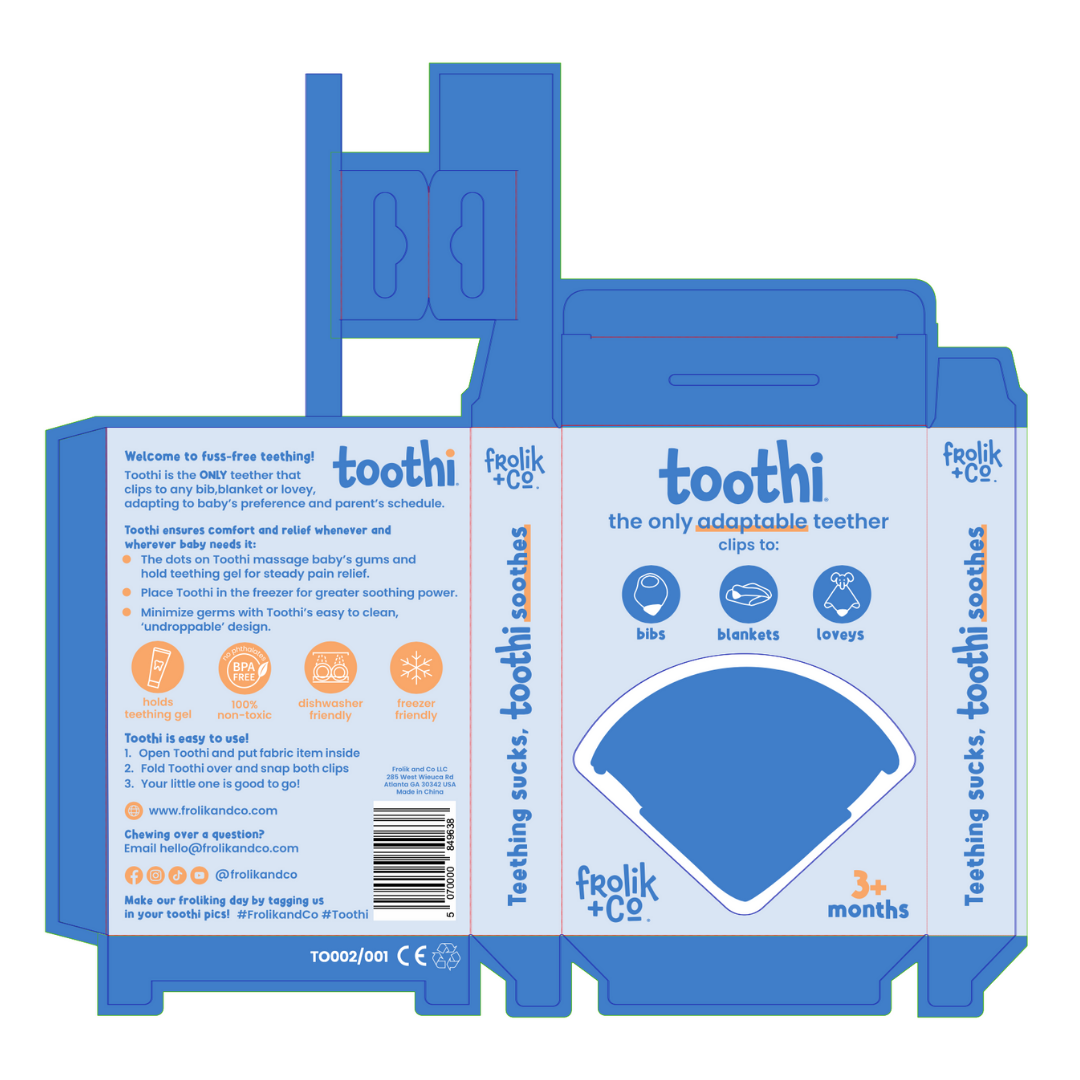
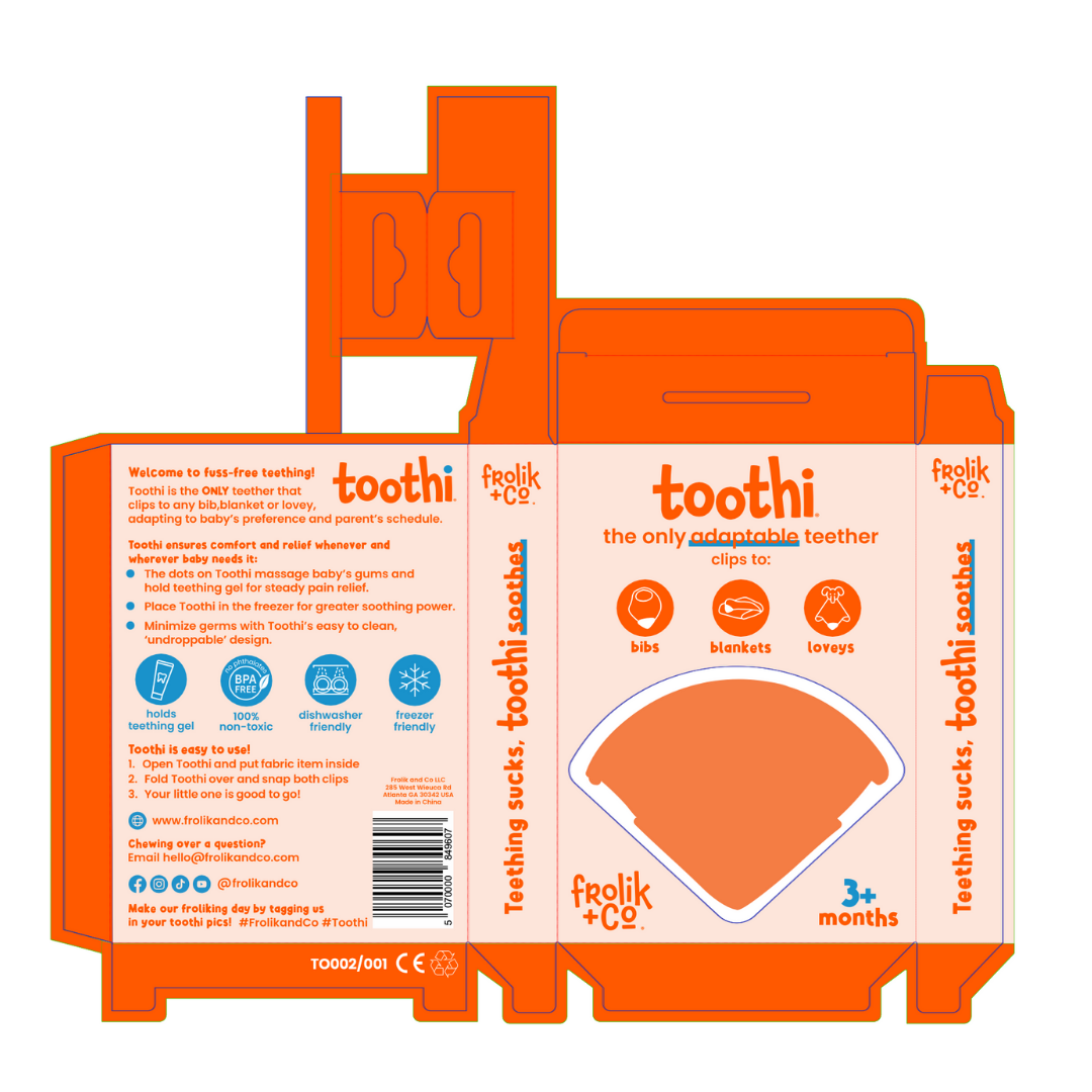
colour palette: carefully curated bold and bright colour combinations that immediately grab attention on the shelf.
typography: a playful font for headers and key details to inject personality into the design while maintaining readability.
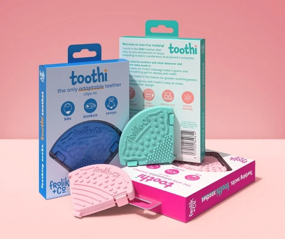
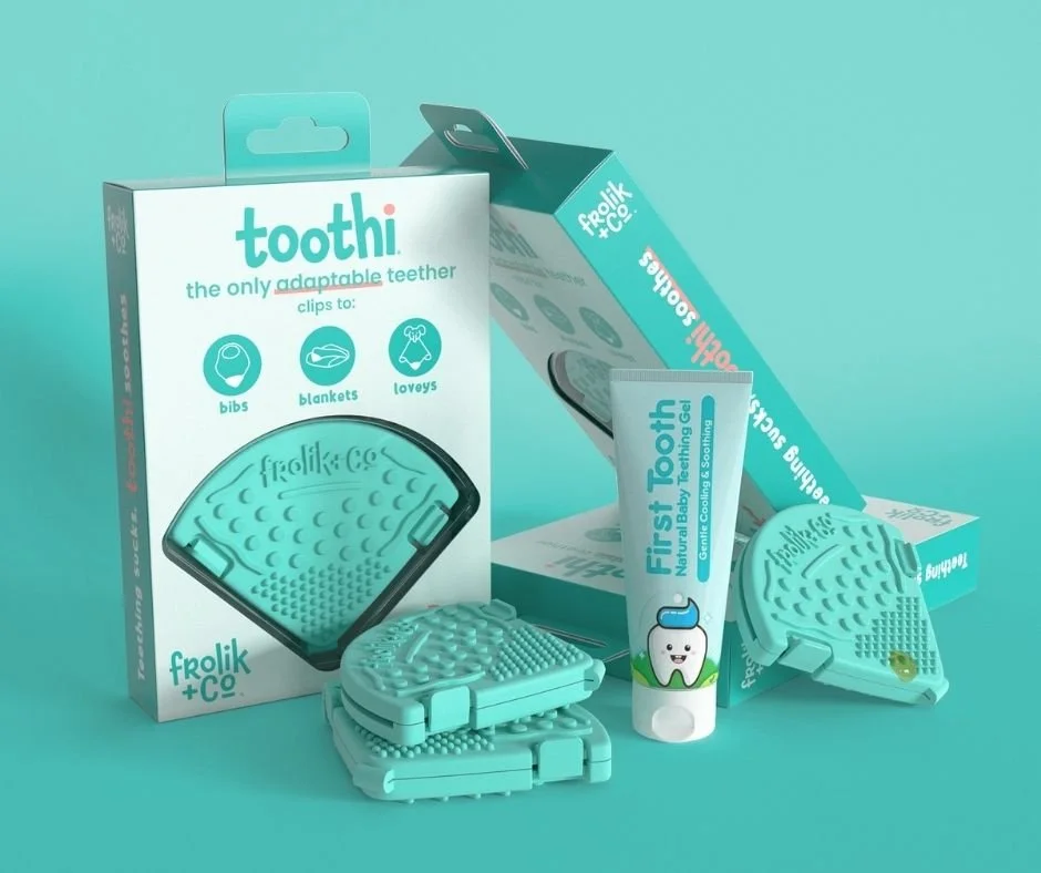
illustrations: hand-designed visuals on the front to show how toothi adapts to everyday items like blankets, bibs and loveys.
minimalist layout: a clean structure that focuses on the product and provides essential information at a glance.
functionality: the back panel features clear instructions for use and care tips, ensuring the product is easy to understand and use.
final thoughts
the Toothi packaging design redefines baby product branding by speaking directly to parents with a vibrant, fun and polished look. it’s a perfect blend of boldness, functionality and charm, designed to stand out in today’s competitive market.

let’s collaborate
if you’re after packaging and branding with personality, let’s work together and bring your ideas to life!